Color plays an important role in how your brand is perceived. Whether you’re a fashion brand trying to connect to a youthful audience or a medical supplies store trying to strengthen customer trust, you can study color meanings to help you better attract and connect to your ideal customer. Color psychology can be used to help build a strong, relatable brand. In this article, we’ll explain what color psychology is and educate you on the color meanings for the most popular colors used.


What is Color Psychology?
Color psychology is the study of colors in relation to human behavior. It aims to determine how color affects our day to day decisions such as the items we buy. Does the color of a dress compel us into purchase? Do the colors of a package make us choose one brand over another? Does the color of an icon make us more likely to click on it? The short answer is yes. But the why part is a bit more complicated. Color meanings can have an impact on why we prefer certain colors over others. The same color can also have different meanings that are dependent on our upbringing, gender, location, values, and a variety of other factors.
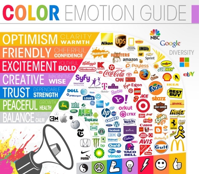
Image Credit: Huffington Post
Why Is Color Psychology Important in Marketing?
Color evokes feeling. It incites emotion. And it’s not any different when it comes to selecting colors for your business.
Choosing the right colors for your marketing efforts can be the difference between your brand standing out from the crowd, or blending into it. By using colors strategically for your marketing efforts, you can get your audience to see what you want them to see and help them perceive you the way you aim to be perceived. This is why understanding color psychology can be so useful for your marketing efforts. Because it can help you portray your brand the way you want to.
While choosing the right colors can enhance your brand perception, poor color selection can do damage to your brand image. For instance, if you choose the wrong colors for your content or logo, it can turn out to be less readable, and hard for your audience to understand. Or you can risk being ignored all together.
Color can be used by marketers to influence how people think and behave toward a brand, and how they interpret any information. The choice of colors can help people decide what is important. And that’s why content marketers need to understand what different colors mean.
List of Color Meanings
Red Color Psychology
Marketing colors like red can capture attention. The red color meaning is associated with excitement, passion, danger, energy, and action. You might’ve noticed that some brands use red for ‘order now’ buttons or for their packaging as a way to stand out on the shelf. In color psychology, red is the most intense color. And thus, can provoke the strongest emotions. Red can also trigger danger so you want to use the color sparingly. If you add the color red to your website, save it for the call to action or sale icons if it’ll contrast well with your store design.
Red is the iconic color used for brands like Coca Cola and YouTube. The color red tends to encourage appetite hence why brands like Coca Cola use it often in their branding. They also use words like happiness in their branding so they use the color red to build excitement. YouTube likely uses the color red due to the excitement of watching videos online. Notice how the red part of their logo is the play button which can help compel someone into action. It encourages you to want to press play on their videos.
Orange Color Psychology
In color psychology, orange represents creativity, adventure, enthusiasm, success, and balance. The color orange adds a bit of fun to any picture, website, or marketing material it’s on. Despite it’s attracting color, it’s not as commanding as the color red. Many marketers still use the color for call to actions or areas of a website that they want to draw the eye too.
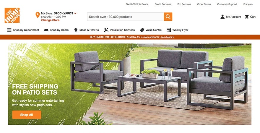
Orange’s color meaning shines through in logos like Nickelodeon and The Home Depot. Nickelodeon is a children’s channel and so the logo accurately represents the creativity and enthusiasm that a children’s show would need through their playful orange color. The Home Depot sells products that you can use for your home. Many Do it Yourselfers (DIY) head to Home Depot to buy products to renovate their home or make adjustments. The orange logo here also represents creativity.
Yellow Color Psychology
In color psychology, the color meaning for yellow revolves around sunshine. It evokes feelings of happiness, positivity, optimism, and summer but also of deceit and warning. Some brands choose to use a cheerful yellow color as the background or border for their website design. You can also choose to use yellow for your ‘free shipping’ bar at the top of your website if it matches the rest of your website’s design. A little touch of yellow can help your website visitors associate your store with something positive.
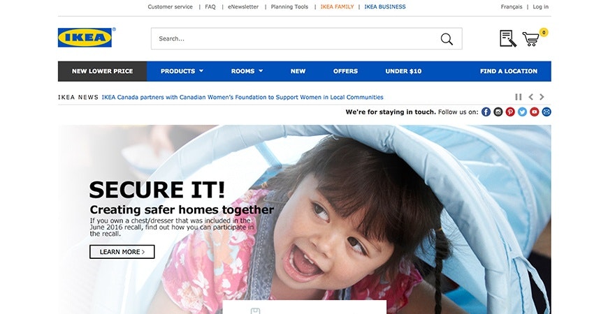
The color yellow is used by brands such as Ferrari and Ikea. Many people dream of driving a Ferrari. The luxury brand is associated with this feeling of happiness, summer and a carefree lifestyle. The Ikea brand also uses the color yellowing in their branding. What does buying furniture have to do with happiness? Well, let’s look at who’s likely buying those products. Many people who’ve just bought their first home or are moving out for the first time, will head to Ikea to buy products to furnish their home. This milestone is usually filled with happiness and optimism for the new change making yellow a great color to associate with the brand.
Pink Color Psychology
Pink is a popular color for brands that primarily serve a female audience. In color psychology, pink’s color meaning revolves around femininity, playfulness, immaturity and unconditional love. Some brands have chosen to use the color pink for the product packaging especially for girl’s toys. Whereas other brands highlight the pink color in their logo, website design, or to highlight key messages.
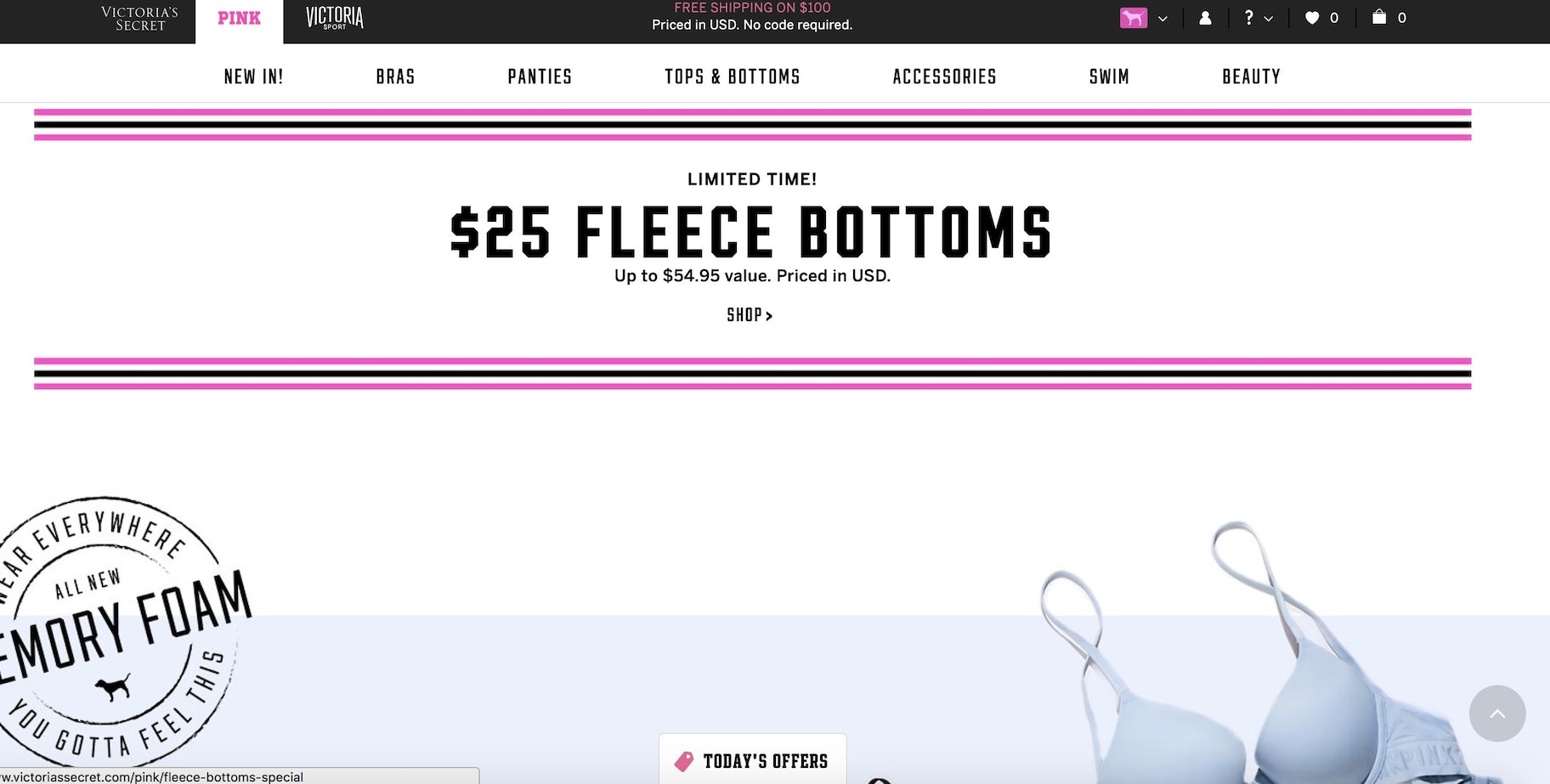
Since the color meaning for pink includes femininity, it’s no surprise that brands like Victoria’s Secret and Barbie use the color so heavily. Victoria’s Secret even named one of their brands Pink. On their website they use a combination of pink and black to highlight key marketing details. Their logo and certain marketing messages also uses the color pink. On Barbie’s website, CTA’s are in a bright pink color. Their top navigation and drop down menu also subtly use the color. And of course, their product packaging and logo reinforce the feminine pink color in their branding.
Green Color Psychology
In color psychology, green is highly connected to nature and money. Growth, fertility, health, and generosity are some of the positive color meanings for the color. The color meaning for green also carries some negative associations such as envy. If you’re in the health or fitness niche, you might choose to add more green to your online store. For example, your homepage banner image or logo might include a green background.
The use of green is made popular by brands such as John Deere and Roots. John Deere’s entire brand revolves around nature. Their product line centers around landscaping, agriculture, lawn care equipment and more. The color green is so ingrained into their branding that even their equipment is the same shade of green as their logo. That way, when someone sees that product, they’ll immediately know it’s a John Deere. Roots is a fashion retailer. However, when browsing their banner images and marketing materials, you’ll often find their models in natural outdoor settings. The green logo blends well with their nature imagery helps them attract outdoor enthusiasts as their target market. So even if your products don’t necessarily tie to a niche, you can use color to help you attract a specific demographic.

Color Psychology Blue
In color psychology, blue’s color meaning ties closely to the sea and the sky. Stability, harmony, peace, calm and trust are just some of the feelings your customer may feel about your brand when you integrate the color blue into your branding. Conversely, blue can also carry some negative color meanings such as depression and can bring about a sense of coldness. Blue can be used in your website’s logo or on your website’s top navigation. Some retailers add their guarantee, trust certification or free shipping icons in a blue color to strengthen the trust aspect the color is known for.
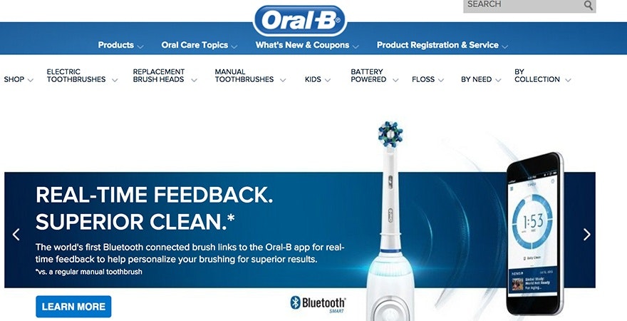
Tech brands like Facebook, Twitter and Skype often use blue in their marketing. But retailers like Walmart and Oral B also use the color. The blue in the Walmart logo can help position the brand as trustworthy, reliable, and relaxing. After all, Walmart is a place where you can buy groceries and do shopping all in one convenient location. Oral B is a dental health brand that sells toothbrushes. Healthcare niches, like Oral B, typically use blue in their branding to help people associate the brand with a quality, reliable and safe product.
Purple Color Psychology
In color psychology, purple is a royal color. The color meaning for purple is connected to power, nobility, luxury, wisdom, and spirituality. But avoid using the color too much as it can cause feelings of frustration. Some perceive its overuse as arrogant. You can add hints of purple to your website’s design such as on your free shipping bar, your logo, and as an accent color in your graphics.
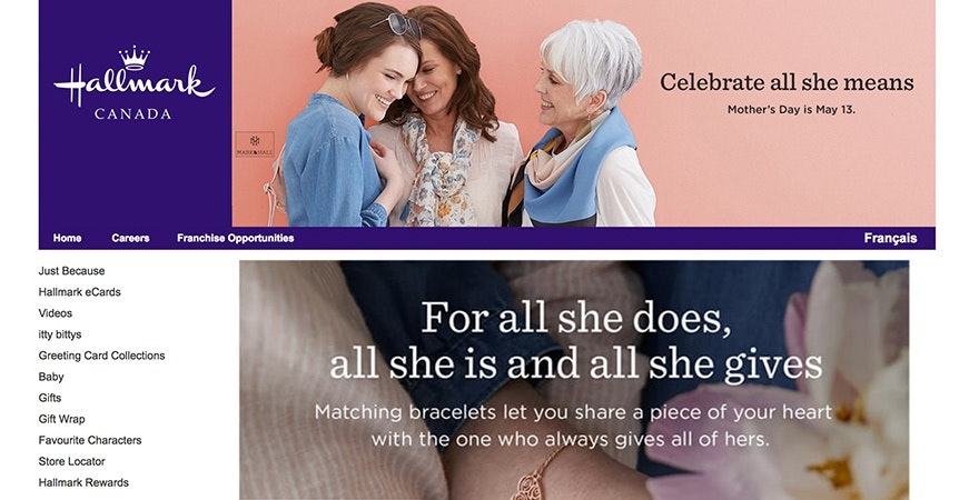
Purple is a color brands like Hallmark and Yahoo use. When browsing both websites, you’ll notice that purple is an accent color. On Hallmark, the logo and the top navigation are purple but the rest of the website uses a variety of other colors. On Yahoo, the logo, top navigation words, and Yahoo icons like Mail use the color purple.
White Color Psychology
In color psychology, white showcases innocence, goodness, cleanliness, and humility. Keep in mind, that this is the meaning in North American culture. In some parts of the world, white has the opposite meaning. You’ll want to keep this in mind based on the target audience you serve. The color meaning for white also has a negative side where it symbolizes sterility and cold. On an ecommerce website, white tends to be the most used color. You’ll likely use it as the background color for your product photo. Your pages will likely have a white background with a black font. This is because, black font on a white background is the best color combination for readability.
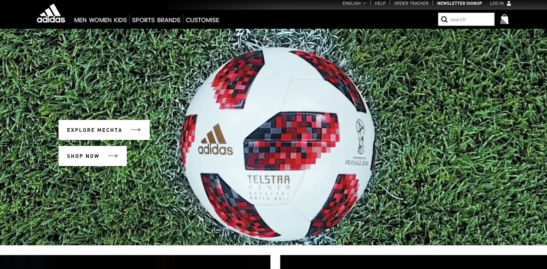
White is the color ASOS and Adidas uses in their marketing. On ASOS, the words in the header, logo, and background are white. When the background is grey or black, the font is white and when the background is white the font is black. On Adidas’ online store, the top navigation is black. The use of a white logo helps create contrast. Since their background is white, they’ve chosen to use grey as a background for product photos to add another tone to the mix. Many brands who have white as a central color tend to pair it with black or grey.
Black Color Psychology
Black is a popular color in retail. In color psychology, black’s color meaning is symbolic of mystery, power, elegance, and sophistication. In contrast, the color meaning can also evoke emotions such as sadness and anger. Many fashion retailers have used black in their logos. Black is also a popular color for text as it’s an easy color to read. Some brands choose to use black and white photos for lifestyle banner images or icons to create a certain tone or consistency on their website.
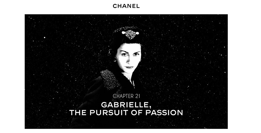
Black is a color retailers such as Chanel and Nike use. Chanel uses black for their logo and has several black and white images on their website to maintain a consistent look. Once you start browsing their website, a thick black top navigation background appears. They use a black font on their graphics for images and for their text. Noticeably, their call to actions are also black. Many retailers in the fashion niche, especially, use black call to actions that contrast well against a white background. Nike also uses a black, white and grey color scheme for their website. Their logo and font is black throughout their website. Thus, making the website easy to read. Like Chanel, their call to actions are also black which draws visual emphasis to add to the item to your ‘bag’ (cart).
Grey Color Meaning
In color psychology, grey represents neutrality and balance. Its color meaning likely comes from being the shade between white and black. However, grey does carry some negative connotations, particularly when it comes to depression and loss. Its absence of color makes it dull. Grey can be used for font color, headers, graphics, and even products to appeal to a mass audience.
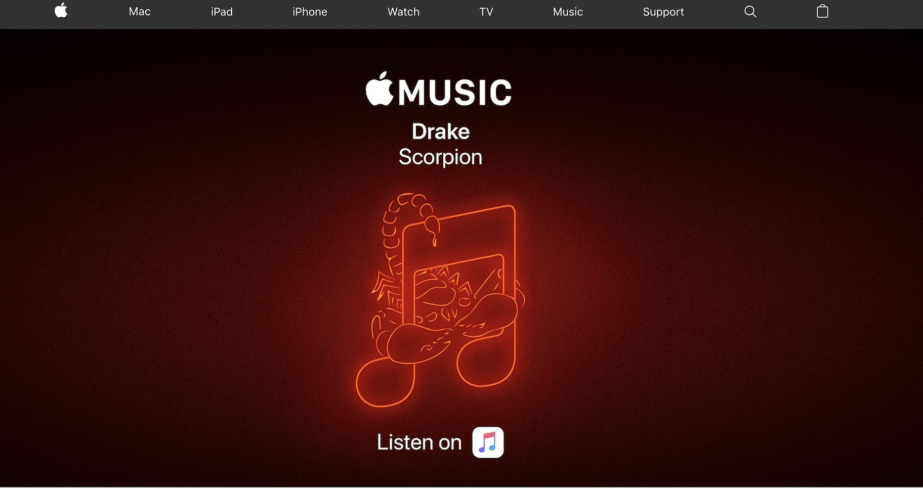
Apple is an example of a brand who uses the color grey in their branding. After all, many of their laptops are in a grey or silver-tone as its neutral color doesn’t put anyone off. On their website, they use the color grey for their header to contrast against a white logo. However, throughout their branding, you’ll see a balance between white, black and grey used which can help maintain a clean, neutral look.
Brown Color Psychology
Brown is an earthy color. After all, it’s the color of earth, wood and stone. So naturally, color psychology highlights that the color meaning for brown relates to comfort, security and a down to earth nature. In marketing, you’ll find that brown is often used for natural products and food. Brown is a color that shows up in logos, banner images, and sometimes even text due to its contrast on a white background.
UPS is an example of a brand who takes advantage of color meanings in their branding. On their website, the brown in their logo is emphasized in the navigation and drop down menus. You might also notice that complementary colors include yellow and green which all have natural elements to them. For example, yellow might represent the sun and green might represent nature. Altogether, it helps position UPS brand as a secure, reliable and down to earth company which is exactly what you’d want from a delivery service.

Misconceptions Around the Psychology of Color
Even though color psychology has been studied and analyzed for many years, there’s still much debate about the exact impact that color has on human psychology.
But the question is: why are there so many misconceptions about the psychology of color and its meaning?
One of the reasons is because when it comes to the psychology of color there are many variables in place. There’s a chance that different people perceive colors differently. How you perceive a certain color may have a lot to do with your personal preference, experiences in the past, cultural differences, gender differences, and so on.
Conclusion
Now that you’ve learned what color psychology is and what the most common color meanings are for each color, it’s time to apply them to your business. While many niches have common colors used, such as blue for health care, you don’t always have to follow the rules. Consider choosing colors that represent what you want your brand to be about or what you want your customers to feel when browsing your online store.
Want to Learn More?
- Design Your Line: 21 Ready-To-Use Online T-Shirt Templates and Mockups
- 26 Free Business Name Generators to Find the Best Brand Names
- Brand Awareness: 5 Tips for Creating a Powerful Brand Identity
- The Ultimate Guide to Starting a Women’s Clothing Brand
- 10 Branding Statistics You Need to Know [Infographic]
What colors do you use on your online store? Do you think color meanings matter? Let us know in the comments!
