Small things have great power.
This article will give you an edge over your competition – and that competition is fierce.
The fact is that 2.3 billion logged-in users visit YouTube every month. That’s half the internet, without counting viewers who don’t log in.
So how can you get more people to watch your videos?
The first step – using the right thumbnail size for YouTube
This article will reveal the perfect YouTube thumbnail size, best practices for creating a thumbnail, and other top tips to get more views.


Best Size for YouTube Thumbnail
YouTube’s help center notes five important points when it come to YouTube thumbnail images. If you follow these guidelines, you will see YouTube success. These five points are:
- The perfect YouTube video thumbnail size is 1280 pixels by 720 pixels.
- These YouTube thumbnail dimensions use an aspect ratio of 16:9.
- Make sure your thumbnail size is a minimum of 640 pixels wide.
- Thumbnail images should be under 2MB.
- Image formats are JPG, GIF, or PNG.
What Is the Use of YouTube Thumbnails?
YouTube thumbnails are the small preview images used to represent videos. Their job is to attract people’s attention and convince them to watch the video.
Here are some examples of custom thumbnails from Shopify's YouTube channel:
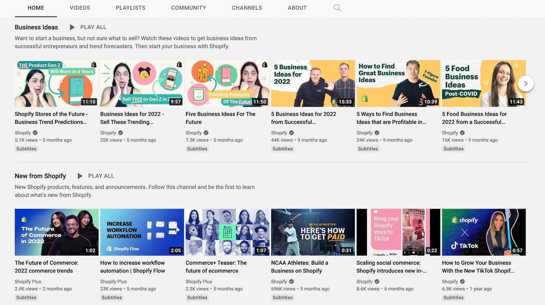
Think of YouTube thumbnails like book covers.
They’re miniature representations of the video content designed to stimulate interest and curiosity.
Why are YouTube Thumbnails so Important?
They say “Don’t judge a book by its cover.”
However, in reality, most people do, and the same holds true for YouTube thumbnails. This means that thumbnail images can make or break your videos.
A good thumbnail can help you to rack up thousands of views. A bad one will ensure your video stays unseen.
Thankfully, YouTube allows you to customize your video thumbnails.
When you upload a video, YouTube will automatically pull three still images from your video that you can use as thumbnails.
Although there’s that easy option, it’s always best to create custom YouTube thumbnails.
Compare these two images from one of our YouTube videos – which do you think is most likely to catch people’s attention?
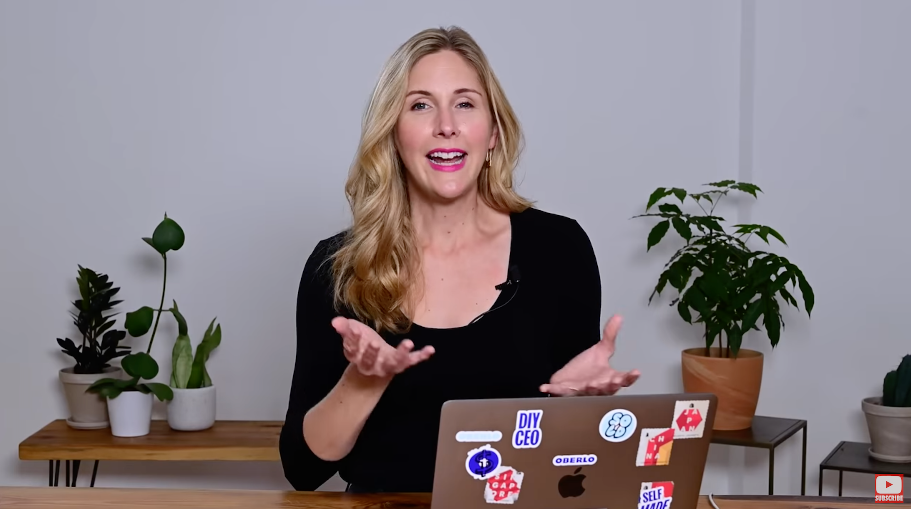
Or:

Custom thumbnails help your videos stand out from the crowd and can have a massive impact on the growth of your audience.
They’re also a great opportunity to develop your brand aesthetic.
But that’s not all. You can even use a custom YouTube video thumbnail to increase your email marketing click-through rate. In fact, Wistia found that using video thumbnails instead of images in emails can increase clicks by more than 21 percent.
Plus, thumbnail images don’t take much time to create.
After the time you’ve spent planning, organizing, filming, and editing the perfect YouTube video, what’s another 10-15 minutes?
Don’t fall at the last hurdle.
Ensure your video’s success when you create a compelling custom YouTube thumbnail.
What is the YouTube Thumbnail Size?
Before you begin, it’s helpful to know the ideal size for your YouTube thumbnail.
Google recommends that your custom YouTube video thumbnail size is 1280 pixels wide by 720 pixels tall. Your image should also have a minimum width of 640 pixels.
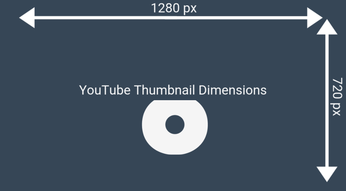
In other words, the ideal custom YouTube thumbnail size is big.
Google explains why: “Your custom thumbnail image should be as large as possible, as the image will also be used as the preview image in the embedded player.”
It’s called a “thumbnail” because it’s often displayed small:
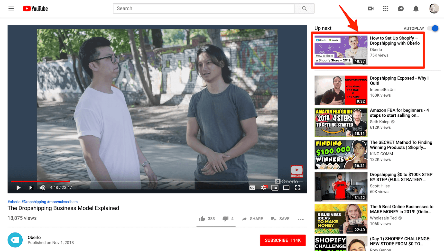
However, the image also needs to be big enough to look good when displayed the same size as the video player:

The YouTube thumbnail ratio for these dimensions is 16:9.
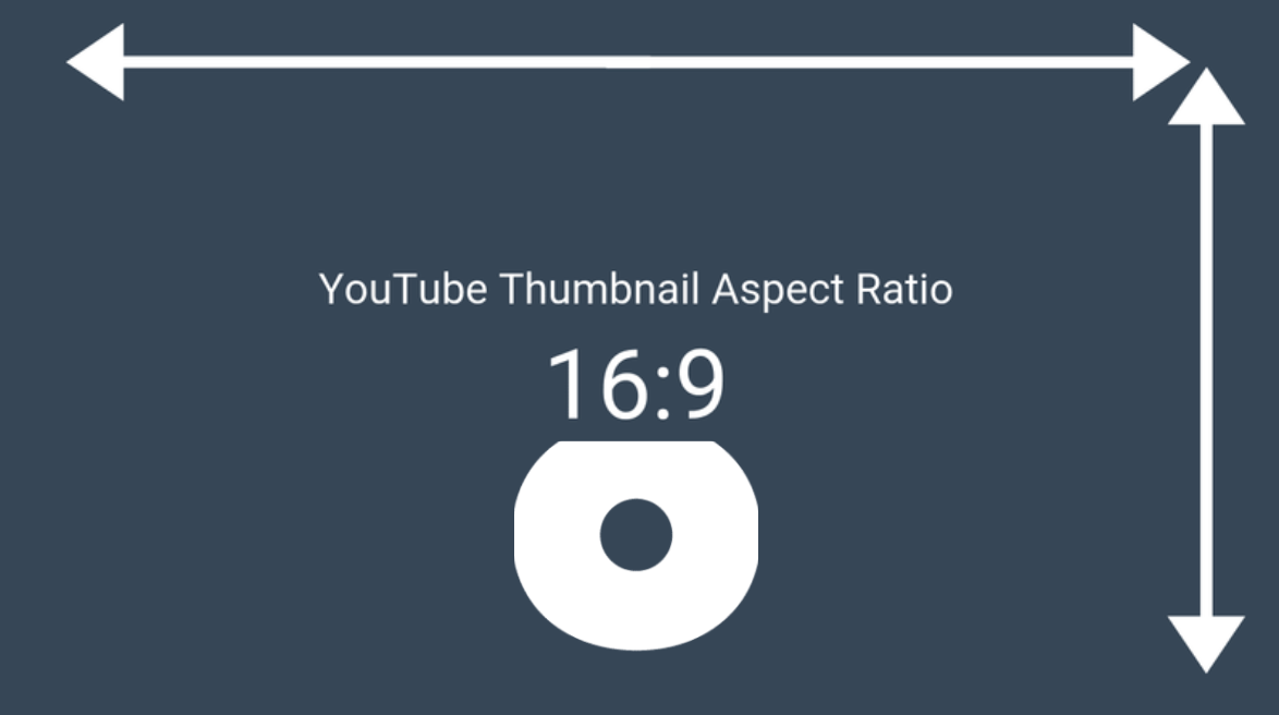
You can use both the images above as custom YouTube video thumbnail resolution templates.
You must also upload your thumbnail in one of the following image formats: JPG, GIF, BMP, or PNG.
Lastly, your custom YT thumbnail size must be under the 2MB limit.
How to Add a Custom YouTube Thumbnail to Your Video
Let’s run through how to upload your custom thumbnail image.
To start, head to YouTube.com and click the camera-plus icon to upload a new video.
To add a custom thumbnail to a video that you’ve already uploaded, head to your videos in the YouTube Studio dashboard. Then click on the video to edit its settings.
In the video’s settings, you’ll see three automatically generated thumbnails at the bottom of the screen.
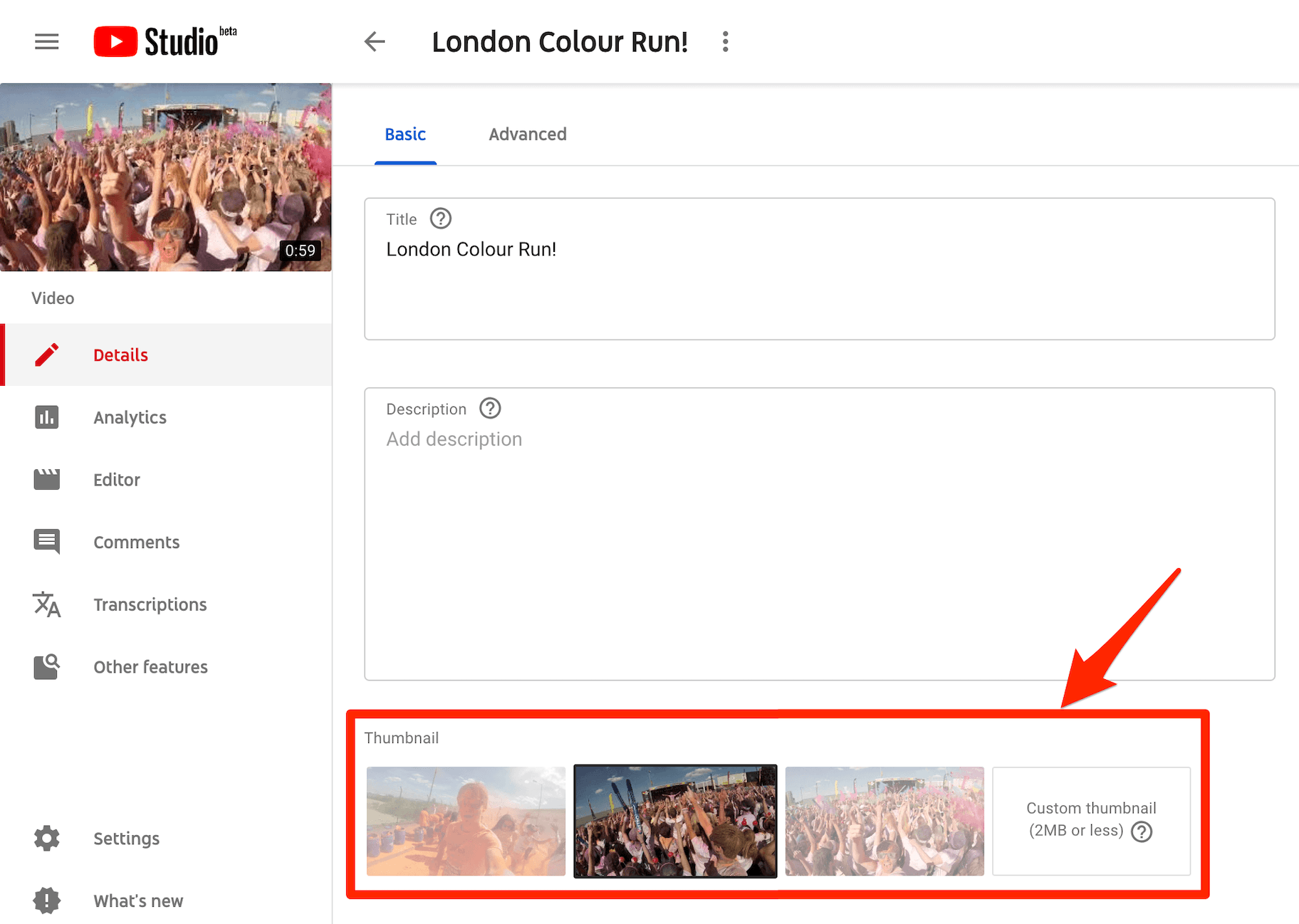
On the bottom right-hand side of the screen there’s the option to upload your custom YouTube thumbnail.
Just click the box, select your image from your device, and click “Upload.”
6 Tips for Creating Effective Thumbnails
YouTube thumbnails provide an incredible creative opportunity. However, it can be hard to create an effective thumbnail every time.
Here are six tips of where to start when creating your thumbnails.
1. Use a Still Image from Your Video
This is the most basic form of YouTube thumbnail.
If you’re lucky, you might find that YouTube has automatically selected the perfect still image from your video to use as a thumbnail.
Alternatively, you could export a particular still image using video editing software.
What if you’re updating old YouTube video thumbnails and don’t have the original video? In this case, you can always pause the video on a still you like, make the video fullscreen, and then take a screenshot.
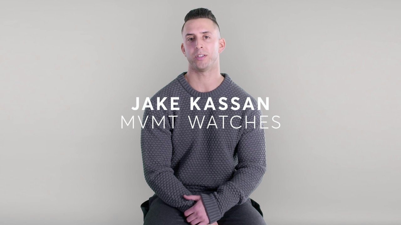
Then, you can simply use the image by itself or add a title, like in this video from Shopify, which tells the story of MVMT Watches.
2. Create a Custom Graphic
Many brands create an image thumbnail that effectively represents the video content. Often this will include a short title summing up the video’s key benefit.
These types of YouTube thumbnails will include the brand’s name or logo.
Here’s an example of a YouTube video thumbnail graphic that we made for our video that teaches you how to launch your first Facebook ad campaign.
3. Combine a Video Still with Graphics
You can combine a still image from your video with graphic elements to create a truly attention-grabbing and compelling YouTube thumbnail.
This is a popular option for videos that include people, such as a vlog, tutorial, or talk show.
Here’s a thumbnail image we made for our video teaching you how to find a good dropshipping supplier.
4. Write Eye-Catching Titles
YouTube videos are only as good as their titles – well, this is not completely true but the title of your YouTube video is important. Including it in your thumbnail is also essential. Let people know exactly what your video will be about while also trying to catch their focus through carefully crafted titles.
For example, we could create a video about video marketing and title it “Everything about Video Marketing ” or we could be crafty and title it “Video Marketing in a Nutshell: 6 Tips to Elevate your Video Marketing in 2024”. Which would you be more inclined to click on? The second one is more eye-catching.
5. Avoid Misleading Images and Titles
When creating thumbnails and titles it can be easy to get carried away, especially while trying to optimize traffic to your YouTube channel. This is completely normal but it is important to keep your creativity in check to ensure you are not creating misleading images or titles.
For example, if your thumbnail contains the text “How to create an amazing YouTube Thumbnail Image” but your video is about the top 6 ways to optimize your thumbnail, the content you are promoting is misleading. Keep your image simple and to the point to increase your video click-through-rate.
It is also crucial not to include images that are unsafe for your audience. Don’t use imagery that is excessive, over-the-top, or inappropriate as you don’t want to scare your target audience away.
Avoid using another person’s image also as the use of reverse image search tools can track the image back to its owner and get you in a lot of trouble.
6. Test Different Thumbnail Designs
When in doubt about what thumbnail design suits your YouTube channel, don’t be afraid to test different designs. Identify a design that you like, pick a video that performs well, change the thumbnail to the new design, and track results. If your click-through rate increases after you have changed the thumbnail image, then this design is better suited to your audience than the previous one.
The best thing about testing is that you can keep trying different designs, as long as you base your findings on significant data. If a video is only receiving one or two clicks a week or month, the findings are not significant enough to prove anything.
If you need to grow your YouTube views before testing different thumbnail designs check out our article, 18 Easy (and Free) Ways to Get More Views on YouTube for some easy to implement ideas.
3 Free Tools to Create a YouTube Thumbnail
There are tons of amazing tools out there that will help you to create an eye-catching YouTube thumbnail design. You can simply use a free image resizer tool to solve size issues but for heavy lifting photo editing here is a quick overview of three awesome design tools.
1. Create a Thumbnail for YouTube with Canva
Best for: Regular users looking for a wide selection of design elements.
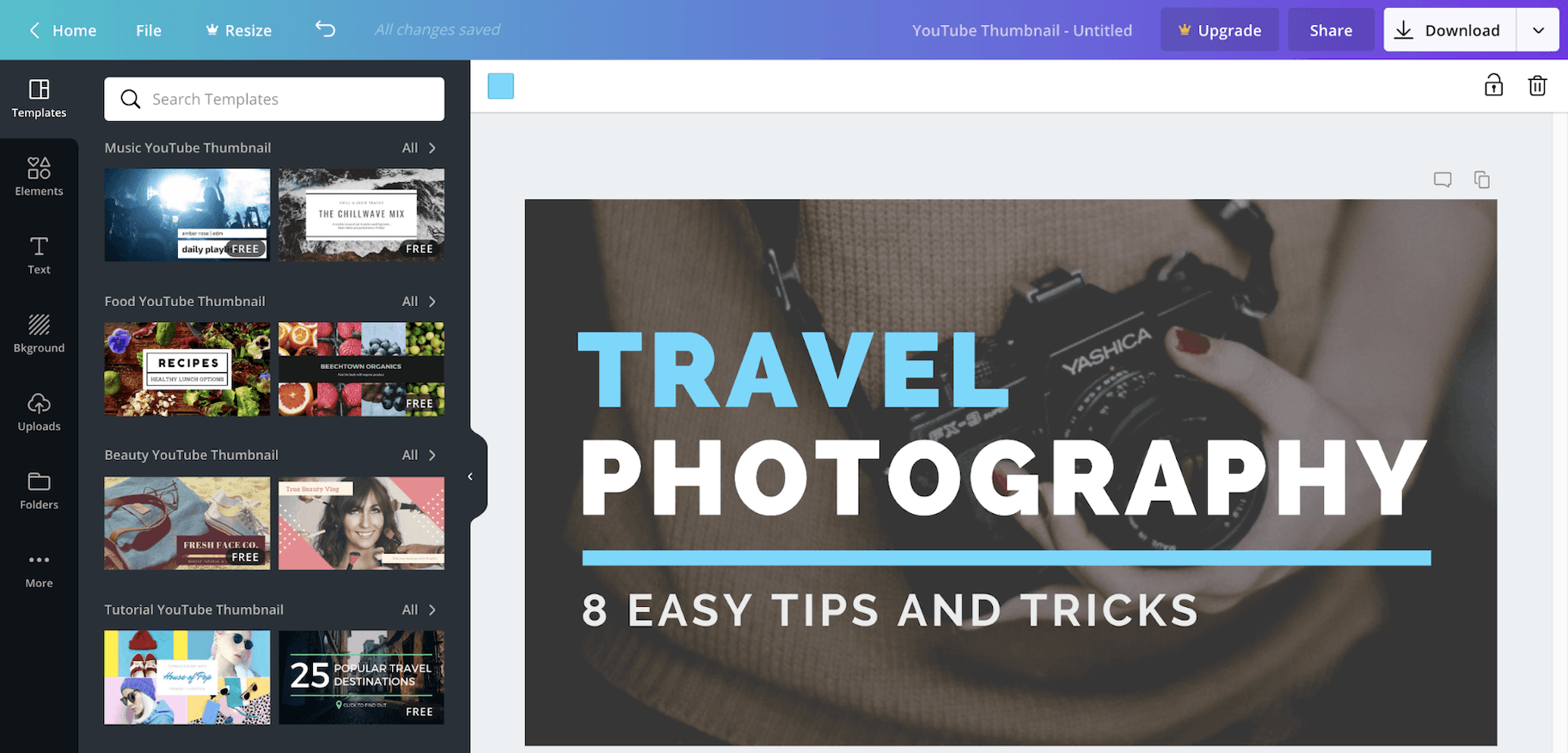
Canva is a hugely popular online graphic design tool.
It provides a wide selection of incredible YouTube thumbnail templates to get you started. There are also tons of fonts, stock images, icons, and illustrations to help bring your ideas to life.
The best part?
Canva is completely free to use. Plus, you get 1GB storage for photos and assets and access to more than 8,000 templates and free images.
You can upgrade for $12.95 per month to access additional features, stock images, templates, and graphic elements.
2. Create a YouTube Thumbnail with FotoJet
Best for: Casual users who would prefer to avoid creating another online account.
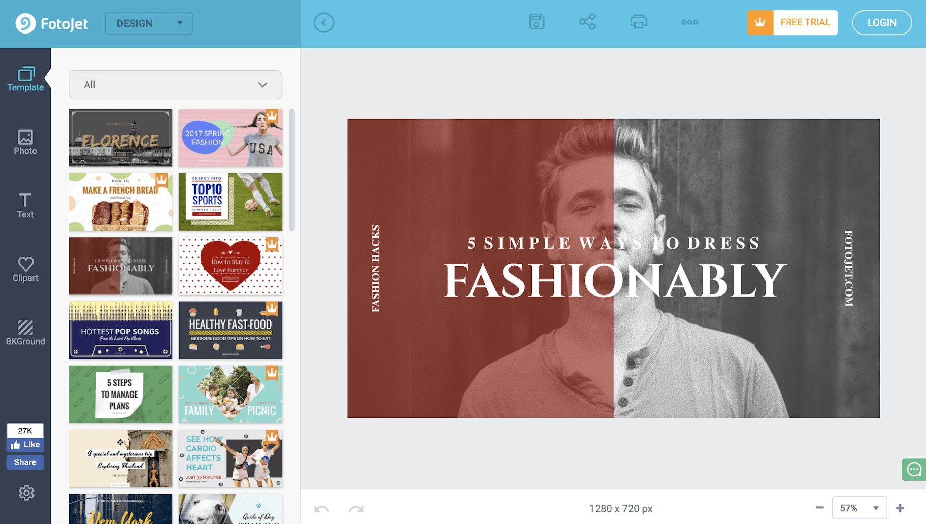
FotoJet is another great online design tool.
Like Canva, it provides plenty of YouTube thumbnail templates, clipart images, and fonts that you can use to create the perfect design.
However, unlike Canva, you’re able to use Fotojet for free without registering an account.
If you’d like more options and features, you can always upgrade to FotoJet Plus for $6.99 per month or $39.99 per year.
3. Create YouTube Thumbnails with Adobe Spark Post
Best for: Adobe Creative Cloud users and those familiar with Adobe’s other design tools.

Adobe Spark Post comes from a family of heavyweight professional design tools. As a result, it has all of the professional features you’d expect.
This editor also provides an array of templates, fonts, and composition tools.
The key selling point of Adobe Spark Post is its integration with Adobe Creative Cloud.
So if you already use Photoshop for your photo edits or Premiere Pro CC for video editing, it makes sense to keep everything in one place.
However, this convenience comes at a price.
You can use Adobe Spark Post for free, but it’ll include a watermark on your designs. To remove this and access more features, plans start at $9.99 per month or $99.99 per year.
8 YouTube Thumbnail Best Practices with Examples
Now that you know the technical details, let’s look at how you can create a YouTube thumbnail that captures people’s attention and convinces them to click through to watch your video.
Here are eight YouTube thumbnail best practices to keep in mind.
1. Your Thumbnail Must Accurately Represent Your Video
First things first: Don’t mislead your viewers by creating a thumbnail image that doesn’t accurately represent your video.
Everyone hates clickbait.
Not only is this a great way to annoy the people you want to create lasting relationships with, but you’ll also hurt your YouTube channel.
How? Because of something called “Audience Retention.”
Audience Retention is a YouTube metric used to determine the quality of your views on YouTube.
In other words, this metric isn’t concerned with how many views you get, but how long your viewers spend watching your video.
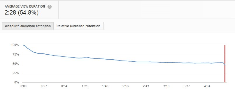
This is extremely important.
YouTube’s algorithm rewards channels that retain viewers.
If you create a YouTube thumbnail image that misleads users, as soon as the video starts playing they’ll know they’ve been tricked and click off.
This will drastically hurt your video’s Audience Retention score – and as a result, YouTube’s algorithm will punish your channel.
Honesty is the best policy. Make sure your thumbnails are fair representations of your videos.
2. Include a Shortened Version of Your Video Title
It’s likely that many users on YouTube will look at video thumbnails before reading the video’s title or description.
For this reason, it helps to include your video’s title in the thumbnail itself.
However, since space is at a premium, it’s often better to include an abbreviated version of your video title.
In the thumbnail example below for our video on how to start a dropshipping store with Shopify, we shorten the title from:
“How to Set Up Shopify – Dropshipping with Shopify”
To:
“How to Build a Shopify Store – 2024”
Notice also that the abbreviated thumbnail title focuses on the key tutorial that the video provides to viewers: how to build a Shopify store yourself.
3. Make Sure Thumbnail Text is Large Enough to Read
Highlighting a key benefit in the thumbnail can make a huge difference to the number of views you receive – but only if users can read the text.
Frank Body uses great still images from their videos to create their YouTube thumbnails, but the text is extremely small.

This makes the text difficult to read.
What’s more, the image above was taken on a computer – these thumbnails would be displayed even smaller on smartphones.
It’s clear from Frank Body’s thumbnail images that they deliberately avoid overlaying text on a model’s face. This makes sense when you don’t want to detract from the image itself.
However, in these instances, it might be more effective not to include text.
Just let the image do the talking.
4. Use Contrasting Colors to Capture Attention
Colors are powerful. They draw the eye.
Bright, contrasting colors can help to make your YouTube thumbnails eye-catching and compel viewers to click on your videos.
What’s more, contrasting colors help to make your text stand out so it can be easily read.
Here’s how Gary Vaynerchuk does it.
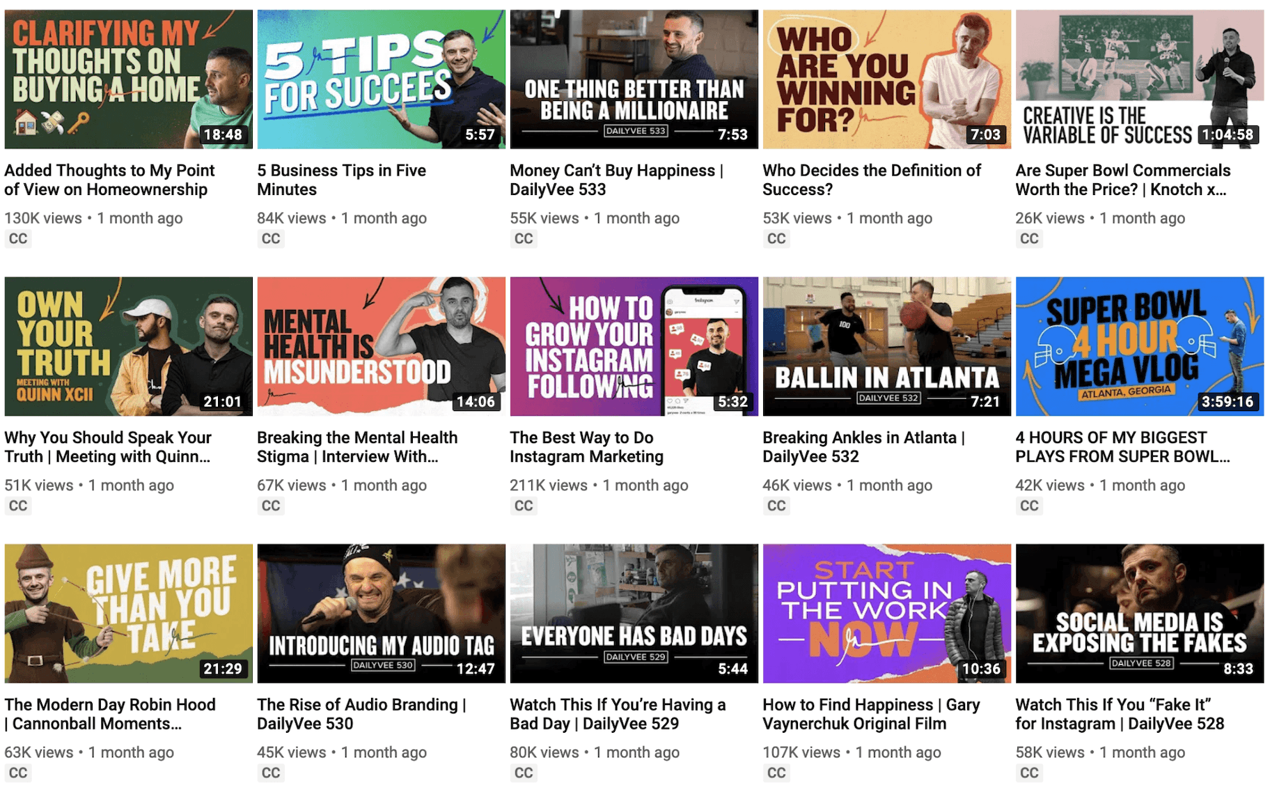
Play around with different contrasting colors to see what works best for your brand.
You can even increase the color saturation or contrast of your thumbnail design to really make the color pop!
5. Use Whitespace and Negative Space
Many brands create thumbnails that look busy and cluttered.
However, sometimes less is more.
In art and design, whitespace or negative space is the area around and between the subjects of an image. It’s an important and a highly effective design tool.
Skullcandy harnesses the power of whitespace and negative space in this clean and professional thumbnail.

The space creates a professional, sleek, and classy aesthetic.
The French classical composer Claude Debussy famously said, “Music is the silence between the notes.”
So when creating your thumbnails for YouTube, pay attention to space between the images.
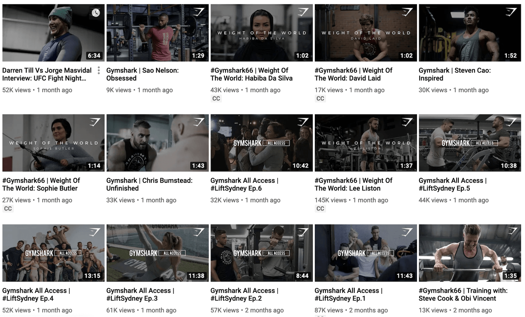
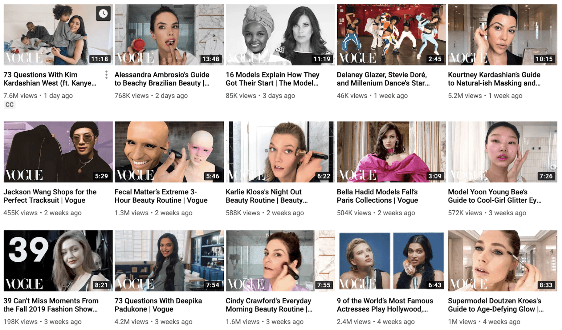
6. Include Your Brand Logo
Strengthen your online brand presence by including your logo or business name in your YouTube thumbnail.
And to create a consistent brand aesthetic, always make sure to position your logo in the same place on each of your thumbnail images.
Gymshark places their logo in the top-right corner of their YouTube thumbnails.
Meanwhile, Vogue always places their logo in the bottom-left of thumbnails.
7. Be Consistent to Develop a Strong Brand Aesthetic
As mentioned above, consistency is the key to developing a strong brand.
So regardless of what type of thumbnail you decide to use, maintain consistency. This will make it easy for viewers to spot your videos when browsing YouTube.
This can help to drive views and engagement.
Strive to develop a distinctive thumbnail design and then stick to it.
For example, we mostly stick with the same YouTube thumbnail template for all of our videos. Then we change the image still, title, and background graphics to keep things fresh.

8. Use Colors to Highlight Different Content Streams
The most successful content marketing strategies will have different content streams to keep people engaged.
What’s more, most brands will find that they can separate their video content into a handful of categories.
What recurring content themes do you have?
The majority of our video fall into one of three categories: Q&A videos, product recommendations, and marketing tips.
Then, we color-code our thumbnails to make things easier for our viewers:
- Yellow for weekly Q&A videos.
- Green for product recommendations.
- Blue for marketing tips.

So boost your views by making it easier for viewers to find the videos they’re most interested in.
Summary: What Are The Dimensions of a YouTube Thumbnail?
Your thumbnails can make or break your video marketing efforts.
Don’t underestimate the power of a compelling design that can capture people’s attention and compel them to click to watch your videos.
Keep in mind these YouTube thumbnail best practices when creating your design:
- Make sure to use the ideal dimensions for YouTube thumbnail– 1280 pixels by 720 pixels.
- Ensure your YouTube thumbnail accurately represents your video content.
- Include an abbreviated version of your title in your YouTube thumbnail.
- Make sure your thumbnail text is large enough to read even on smartphones.
- Use contrasting colors to make your YouTube thumbnails standout and capture attention.
- Use whitespace and negative space to add a touch of class to your YouTube thumbnails.
- Include your brand logo in the same position of each of your thumbnails.
- Test a few different YouTube thumbnail designs to find an effective image.
- Consistently use the same YouTube thumbnail template to develop a strong brand aesthetic.
- Color-code different content streams to make it easy for viewers to identify their favorite type of videos.
Lastly, make sure to spend a little time to create a great design.
Because as the American baseball player Charles Comiskey once said, “It is the small things in life which count; it is the inconsequential leak which empties the biggest reservoir.”

